

Color is a fundamental element that breathes life into every space. It has the power to evoke emotions, set moods, and create an atmosphere that resonates with our personal style. Understanding the different aspects of color and how to harness its potential is essential for interior designers and enthusiasts alike.
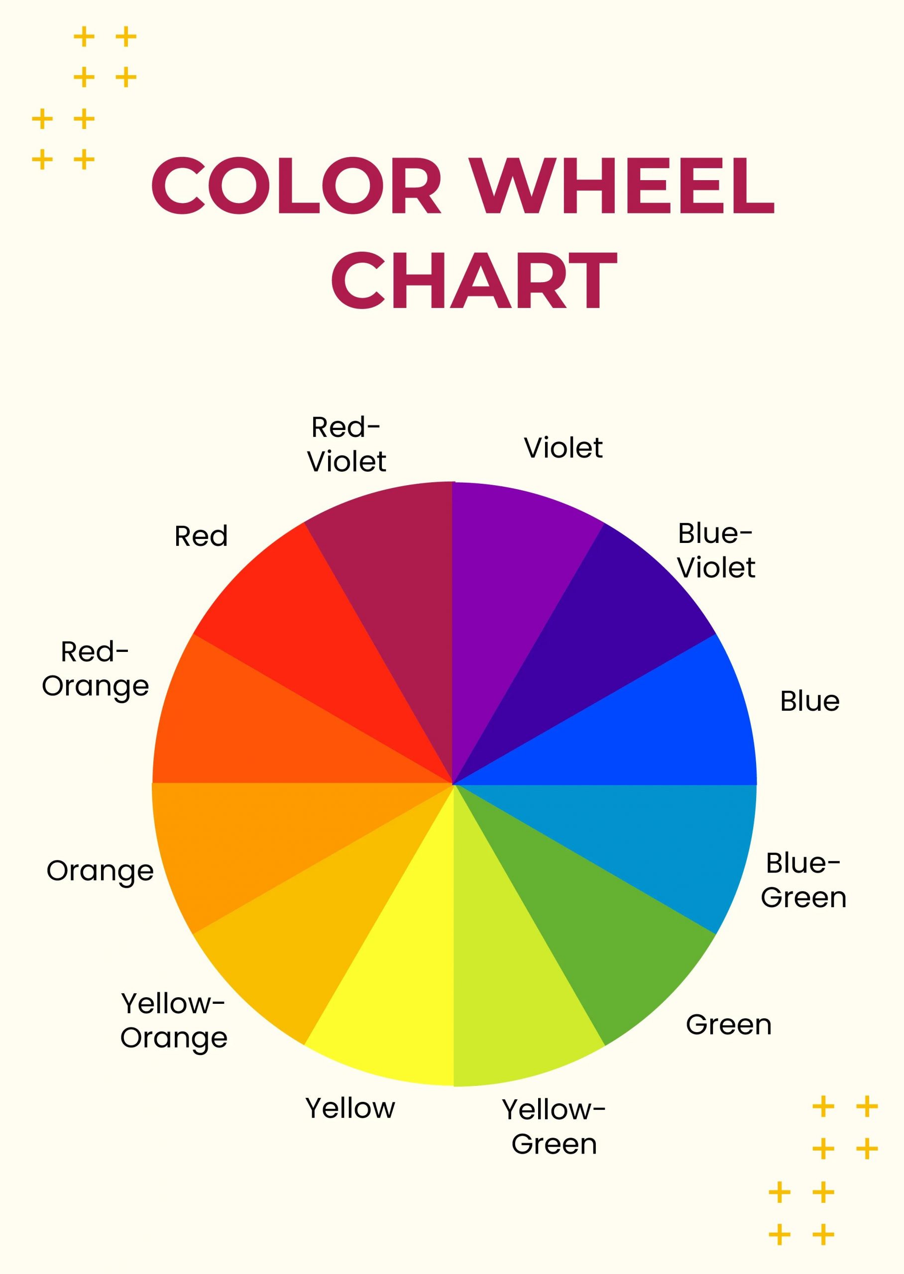
In this article, we will explore the nuances of primary, secondary, and tertiary colors, as well as discussing three compelling options for color selection in interior design: monochrome, harmonious colors, and complementary colors. By expanding our knowledge and embracing our intuition, we can confidently navigate the realm of color to create captivating and harmonious interior spaces.
Primary, Secondary, and Tertiary Colors: Let’s begin by revisiting the basics of color theory. The primary colors, as we all know, are red, yellow, and blue – the building blocks from which all other colors are derived. Secondary colors are obtained by mixing two primary colors together, while tertiary colors are created by combining a primary and a secondary color. Understanding these color relationships lays the foundation for exploring more sophisticated color schemes.

Monochrome –
Elevating the Power of a Single Color: Monochrome design is often misunderstood as being limited to black and white. However, the term “monochrome” refers to the use of a single color in a design. While using only one color throughout an entire interior space can be monotonous, there are techniques to bring vibrancy to the palette. By incorporating different tones and tints of the chosen color, a dynamic and visually engaging monochromatic scheme can be achieved. Additionally, introducing neutral shades such as white, metallics, gray, and wood elements can add depth and balance to the monochromatic composition.
Harmonious Colors –
Finding Balance and Cohesion: Harmonious color schemes rely on colors that sit adjacent to each other on the color wheel. By selecting two or more colors in close proximity, a sense of balance and visual harmony is established. For instance, colors like red, yellow, and orange with similar tones can be combined to create a warm and inviting ambiance. Balancing these colors with ample white space allows the hues to shine and interact harmoniously.

Complementary Colors –
The Power of Contrast: Complementary colors offer a striking contrast that can inject energy and visual impact into an interior space. These colors are positioned directly opposite each other on the color wheel, such as blue and orange or red and green. When paired together, complementary colors create a vibrant and dynamic visual experience. By carefully balancing the proportions of each color and incorporating neutrals or muted tones as a backdrop, the complementary color scheme can achieve a bold and harmonious result.
Trusting Your Intuition –
The Artistic Flair of Color Selection: While understanding color theory is crucial, there are moments when intuition plays a vital role in color selection. As an interior designer or architect, there are times when your gut instinct leads you to unexpected yet captivating color choices. This intuitive approach allows for experimentation and personal expression, resulting in unique and memorable interior designs that reflect your artistic flair.
Color selection in interior design is a dynamic process that involves an understanding of color theory, an exploration of various color schemes, and the cultivation of intuition. By embracing the possibilities offered by monochrome, harmonious, and complementary color schemes, designers can create captivating interiors that evoke specific emotions, harmonize with the surrounding environment, and reflect the individuality of the inhabitants. Whether through meticulous planning or following your creative instincts, the art of color selection is a powerful tool that transforms spaces into personalized works of art.
How to Create a Color Palette – 60/30/10 Rule

The 60-30-10 rule is a basic guideline used in interior design to create a balanced color scheme in a room. It helps designers and homeowners select and distribute colors effectively to achieve a harmonious and visually pleasing space. The rule suggests dividing the use of color into three percentages:
60% Dominant Color: This is the primary color that covers the majority of the space. Typically, it’s applied to walls, large furniture pieces, or other prominent surfaces. The dominant color sets the overall tone and serves as the backdrop for the room. It should be a neutral or calming color, as it occupies the largest portion of the space.
30% Secondary Color: The secondary color complements the dominant color. It’s used for upholstery, drapery, or accent walls. This color adds visual interest and contrast to the room while still maintaining harmony with the dominant color. It can be a bolder or slightly different shade than the dominant color.
10% Accent Color: The accent color is the most vibrant or striking color in the scheme. It’s used sparingly for accessories, decor items, throw pillows, or small pieces of furniture. The accent color provides pops of interest and can draw attention to specific areas or elements within the room.
Here’s an example to illustrate the rule:

If you’re designing a living room:
60%: The walls and the main sofa could be a neutral beige or gray.
30%: The secondary color might be a deep blue, used for curtains, accent chairs, and some throw pillows.
10%: The accent color could be a bold red, seen in decorative cushions, artwork frames, and perhaps a vase or lamp.


